


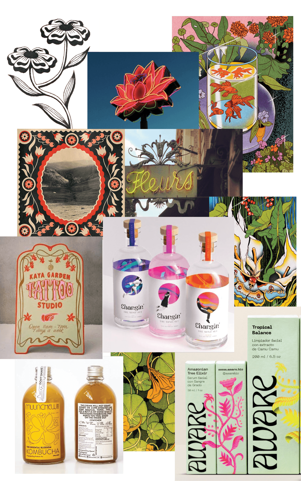


A warm, saturated color palette drawn from the tones of a setting sun communicates the brand’s energy and intended time of consumption. These colors create a striking contrast against the dark coffee liqueur, allowing the label to stand out while alluding to the transformation from dusk into night.
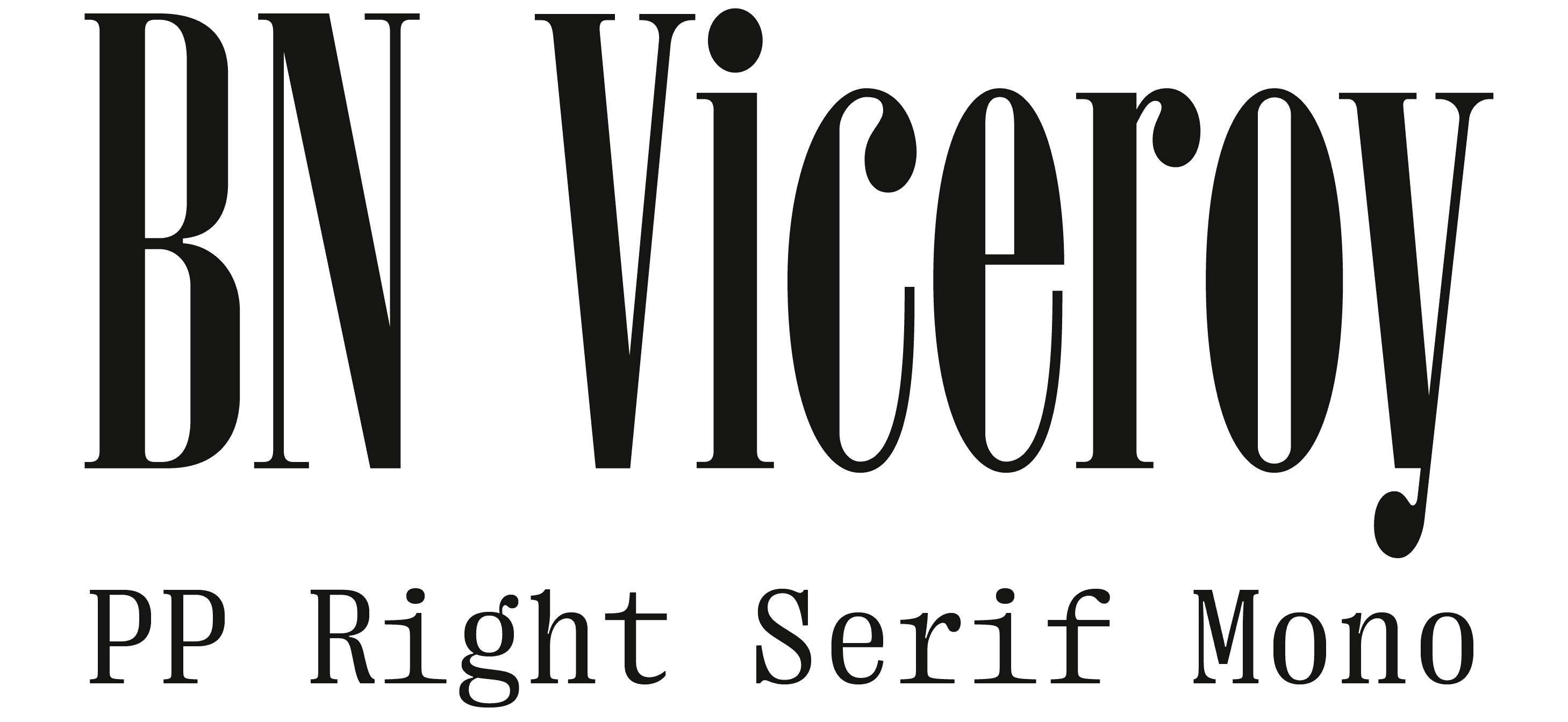
BN Viceroy's tall x-height evokes the elevated sensation of drinking coffee, while the high contrast introduces a sense of sophistication appropriate for a special-occasion drink. PP Right Serif Mono, used for supporting text, was selected for its legibility while introducing a subtle magical quality that complements the brand’s narrative.

The organic, tropical illustrations and patterns complete the visual language, meant to emulate spontaneity and energy of a night unfolding.


The label also incorporates a gradual reveal as the bottle is consumed over multiple evenings. A patterned background printed on the interior of the label slowly becomes visible, creating a changing visual experience that reinforces the brand’s narrative of transformation.